Client: Kaam
Role: Product Designer
Client: LeaderAmp
Duration: 6 months
Role: Product Designer
Client: LeaderAmp
Duration: 6 months
Role: Product Designer
☟
☟
☟
Designing an app for the grey collared job market
Designing an app for the grey collared job market
Designing an app for the grey collared job market
I was commissioned by Purple Pixel to design an app for a jobs seeking platform. The following is a case study of the app I designed. I called it Kaam (in Hindi, meaning, job).
I was commissioned by Purple Pixel to design an app for a jobs seeking platform. The following is a case study of the app I designed. I called it Kaam (in Hindi, meaning, job).
I was commissioned by Purple Pixel to design an app for a jobs seeking platform. The following is a case study of the app I designed. I called it Kaam (in Hindi, meaning, job).
Process
Process
Process
Like with designing any application, there is a loose framework of going about the process. Something like so:
Understanding the brief
Framing the problem
Understanding the user/s
Abstracting a design framework approach
Prototyping the flow/s
Iterating the visual direction
Completion and integration
Like with designing any application, there is a loose framework of going about the process. Something like so:
1. Understanding the brief
2. Framing the problem
3. Understanding the user/s
4. Abstracting a design framework approach
5. Prototyping the flow/s
6. Iterating the visual direction
7. Completion and integration
1. The Brief
1. The Brief
1. The Brief
To design an Android application for connecting a niche segment (grey collared) job seekers with its employers.
To design an Android application for connecting a niche segment (grey collared) job seekers with its employers.
To design an Android application for connecting a niche segment (grey collared) job seekers with its employers.
2. The Need
2. The Need
2. The Need
The jobs finding platforms out there are all evidently there to cater to all the worldly needs under the employment umbrella. You could filter out the segment, industry and nature of work and ultimately get to what you are looking for, but the needs for different segments might not fall within the one-size-fits-all framework. That is especially true for the grey collared segment where things like screening the right candidate by resumes and cover letter are lesser important than in other segments.
The jobs finding platforms out there are all evidently there to cater to all the worldly needs under the employment umbrella. You could filter out the segment, industry and nature of work and ultimately get to what you are looking for, but the needs for different segments might not fall within the one-size-fits-all framework. That is especially true for the grey collared segment where things like screening the right candidate by resumes and cover letter are lesser important than in other segments.
The jobs finding platforms out there are all evidently there to cater to all the worldly needs under the employment umbrella. You could filter out the segment, industry and nature of work and ultimately get to what you are looking for, but the needs for different segments might not fall within the one-size-fits-all framework. That is especially true for the grey collared segment where things like screening the right candidate by resumes and cover letter are lesser important than in other segments.
3. The Users
3. The Users
3. The Users
The job seekers in the segment including restaurant cooks, waiters, delivery boys, drivers, receptionist among others.
The Employer: usually agencies that hire at scale for various organisation’s grey collared staffing requirement and sometimes the organisations (including restaurants, bars and small companies) themselves
- The job seekers in the segment including restaurant cooks, waiters, delivery boys, drivers, receptionist among others.
- The Employer: usually agencies that hire at scale for various organisation’s grey collared staffing requirement and sometimes the organisations (including restaurants, bars and small companies) themselves
4. The Framework
4. The Framework
4. The Framework
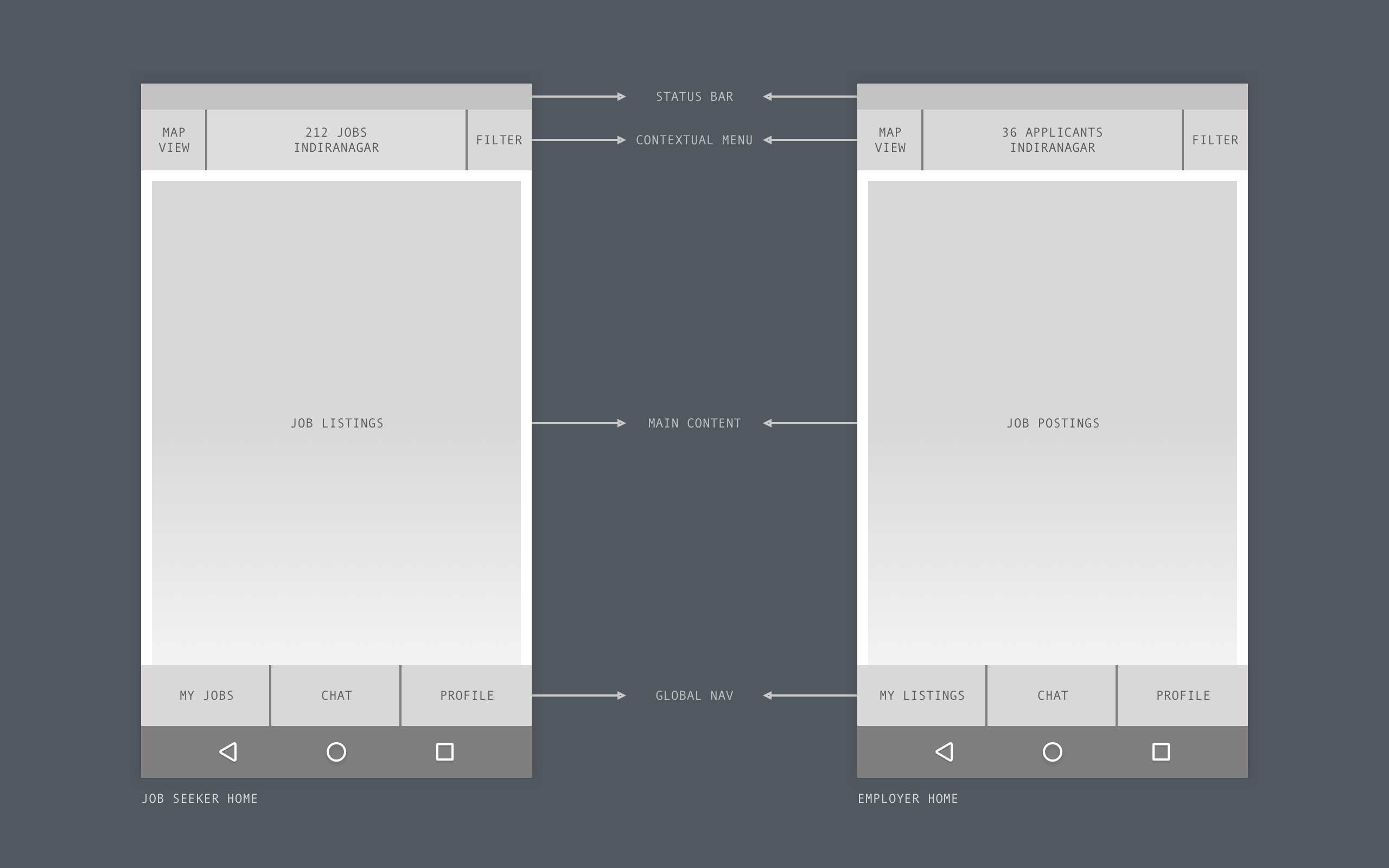
I’m a big fan of the word and the application of designing any product that fits in a framework. A design framework is essentially an overarching guide that allows your design to always remain intact. The idea is to abstract what you are designing to a minimum possible layout and have that framework extend to a maximum possibility scenario within the scope of that project. A design framework makes room for unique scenarios without breaking the overall architecture. It also accommodates for having different user types be able to navigate the app seamlessly by only making relavant information available to them.
In designing the job platform, here on refereed to as ‘Kaam’, the idea was to have a framework that remains unchanged (except for the relevant set of data applicable within) for both the user types, viz. the jobseeker and the employer.
I’m a big fan of the word and the application of designing any product that fits in a framework. A design framework is essentially an overarching guide that allows your design to always remain intact. The idea is to abstract what you are designing to a minimum possible layout and have that framework extend to a maximum possibility scenario within the scope of that project. A design framework makes room for unique scenarios without breaking the overall architecture. It also accommodates for having different user types be able to navigate the app seamlessly by only making relavant information available to them.
In designing the job platform, here on referred to as ‘Kaam’, the idea was to have a framework that remains unchanged (except for the relevant set of data applicable within) for both the user types, viz. the jobseeker and the employer.
5. The Flows
5. The Flows
5. The Flows
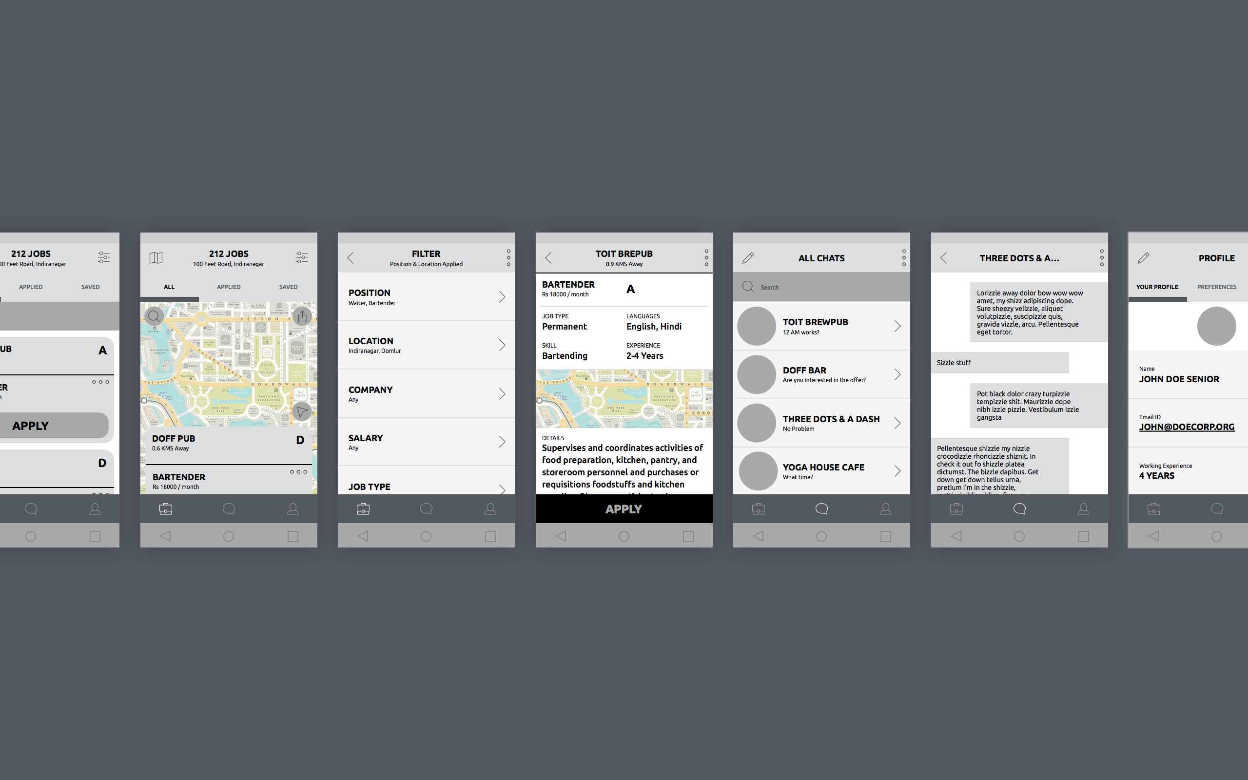
The key components that were considered to be a differentiator and also an opportunity in designing for this market type especially having a chat component. The idea being; employers would be able to screen potential employees by having quickly meet-up to discuss if it’s the right fit, rather than go through a rather lengthy process of form fillings and scanning through applications to find the right candidate. Along with that was to have the function of finding jobs by an area. Each component was detailed out for each user type to make sure there weren’t any gaps in connecting the app while communicating the flows.
The key components that were considered to be a differentiator and also an opportunity in designing for this market type especially having a chat component. The idea being; employers would be able to screen potential employees by having quickly meet-up to discuss if it’s the right fit, rather than go through a rather lengthy process of form fillings and scanning through applications to find the right candidate. Along with that was to have the function of finding jobs by an area. Each component was detailed out for each user type to make sure there weren’t any gaps in connecting the app while communicating the flows.
The key components that were considered to be a differentiator and also an opportunity in designing for this market type especially having a chat component. The idea being; employers would be able to screen potential employees by having quickly meet-up to discuss if it’s the right fit, rather than go through a rather lengthy process of form fillings and scanning through applications to find the right candidate. Along with that was to have the function of finding jobs by an area. Each component was detailed out for each user type to make sure there weren’t any gaps in connecting the app while communicating the flows.
6. Visual Direction
6. Visual Direction
6. Visual Direction
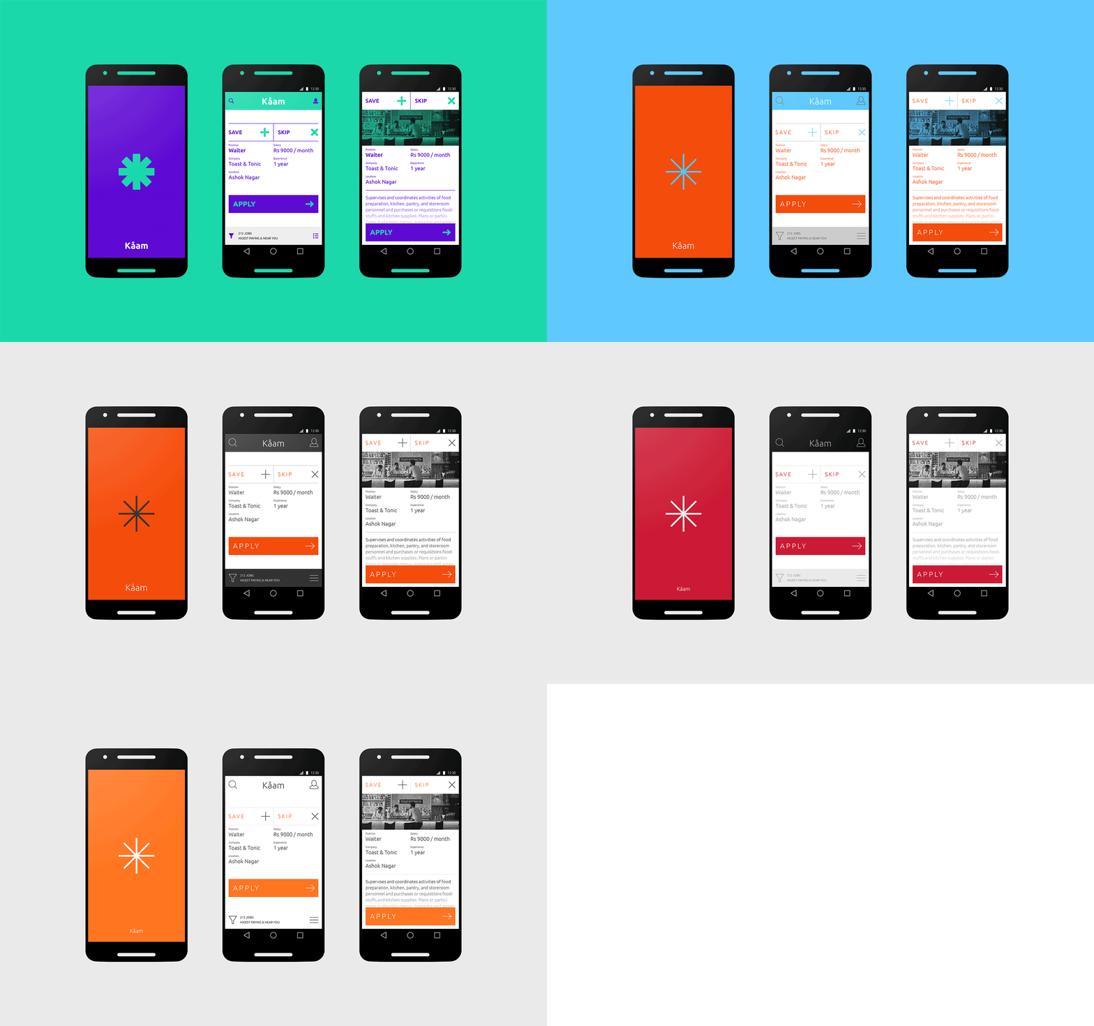
Several different approaches and design direction were taken to get the look and feel of the app just right. Like in the case with most modern app design flow, the final look and feel were designed with having the option to quickly replace the color palette with a range of other colors and styles so the final decision on the app could be taken even at the very last minute without breaking or having to restructure and redesign every component necessary for making the final assets delivery.
Several different approaches and design direction were taken to get the look and feel of the app just right. Like in the case with most modern app design flow, the final look and feel were designed with having the option to quickly replace the color palette with a range of other colors and styles so the final decision on the app could be taken even at the very last minute without breaking or having to restructure and redesign every component necessary for making the final assets delivery.
Several different approaches and design direction were taken to get the look and feel of the app just right. Like in the case with most modern app design flow, the final look and feel were designed with having the option to quickly replace the color palette with a range of other colors and styles so the final decision on the app could be taken even at the very last minute without breaking or having to restructure and redesign every component necessary for making the final assets delivery.
7. Putting it Together
7. Putting it Together
7. Putting it Together
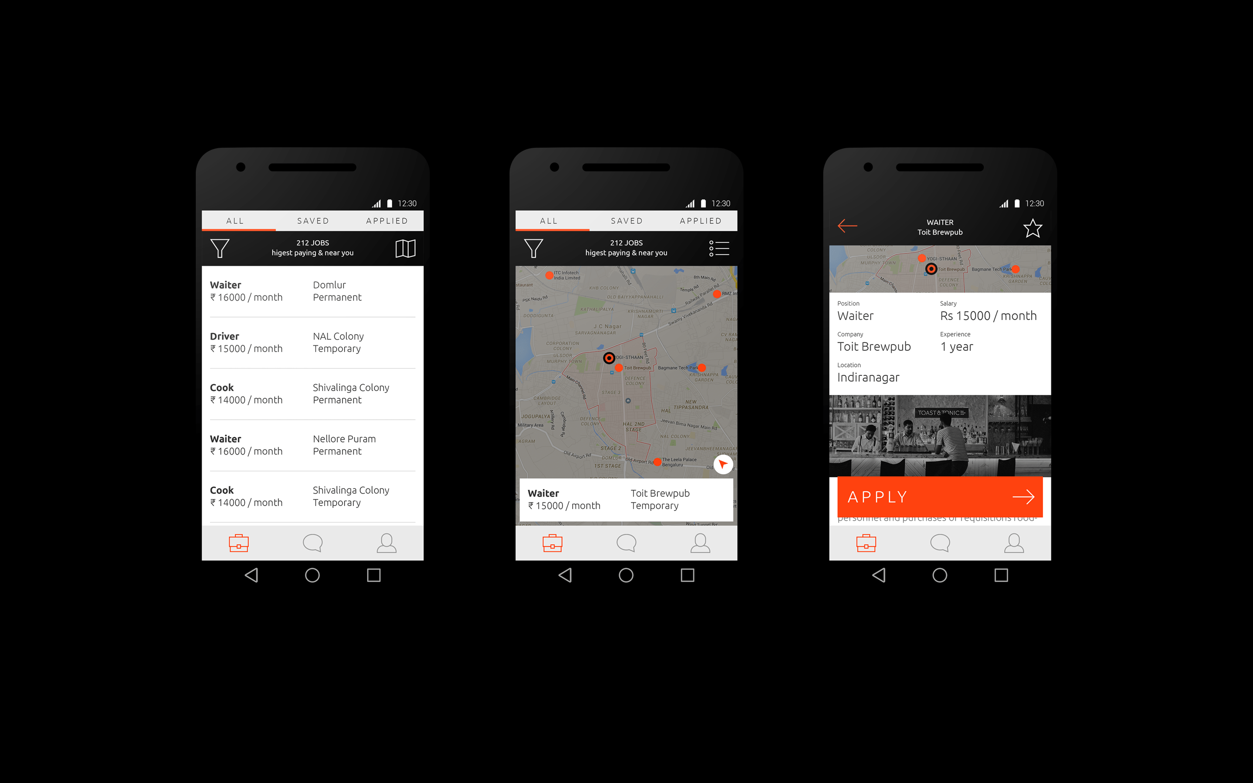
The final version of the Kaam Android App
The problem with the old world approach of isolating the flows from a visual direction leads to a lot of back and forth and sometimes a lot of rework. In following a process of iterative visual along with seeking completion of the flows, the app continuously evolved, both from a UX standpoint and the aesthetic. So with designing the Kaam app, I designed only few screens from the flow for the initial visual direction and then the completion of the app were designed with continuously tweaking the flows in the visual direction stage.
The problem with the old world approach of isolating the flows from a visual direction leads to a lot of back and forth and sometimes a lot of rework. In following a process of iterative visual along with seeking completion of the flows, the app continuously evolved, both from a UX standpoint and the aesthetic. So with designing the Kaam app, I designed only few screens from the flow for the initial visual direction and then the completion of the app were designed with continuously tweaking the flows in the visual direction stage.
The problem with the old world approach of isolating the flows from a visual direction leads to a lot of back and forth and sometimes a lot of rework. In following a process of iterative visual along with seeking completion of the flows, the app continuously evolved, both from a UX standpoint and the aesthetic. So with designing the Kaam app, I designed only few screens from the flow for the initial visual direction and then the completion of the app were designed with continuously tweaking the flows in the visual direction stage.
Other Projects
SurePeople Proper HamburgerUI + UX

2018 CalendarGraphic Design
Rejected Web DesignsWeb Design
Repositioning by rebranding: the Moonraft brand storyProduct Design
LogofolioGraphic Design
Pankaj & Priya wedding collateral designsGraphic Design

The MYLK propaganda designsGraphic Design
