Client: Pickuptrip.com
Duration: 6 months
Role: Product Designer
Client: Pickuptrip.com
Duration: 6 months
Role: Product Designer
Client: Pickuptrip.com
Duration: 6 months
Role: Product Designer
➺
➺
➺
Designing an analytics-based travel technology booking application
Designing an analytics-based travel technology booking application
Designing an analytics-based travel technology booking application

Pickuptrip is an analytics-based travel technology company that aims at improving the travel experience at every single touch point in a users' journey. The core analytics products is a self-learning engine that gathers a lot of data and over time is able to give a customer an advantage by offering better prices, more rewarding packages and tailored itineraries for a more immersive travel experience.
Pickuptrip is an analytics-based travel technology company that aims at improving the travel experience at every single touch point in a users' journey. The core analytics products is a self-learning engine that gathers a lot of data and over time is able to give a customer advantage by offering better prices, more rewarding packages and tailored itineraries for a more immersive travel experience.
Pickuptrip is an analytics-based travel technology company that aims at improving the travel experience at every single touch point in a users' journey. The core analytics products is a self-learning engine that gathers a lot of data and over time is able to give a customer advantage by offering better prices, more rewarding packages and tailored itineraries for a more immersive travel experience.
Pickuptrip is the first 100%-independent travel agent that combines the best the market has to offer in a single intuitive overview where one can in a simple and gamified manner discover, build, book, experience and reflect upon his or her perfect short-stay single-destination trip. It is an analytics-based comprehensive travel platform that aims to change the travel industry for good by shifting transactional power away from the airlines and big booking engines in favour of the traveller.
Pickuptrip is the first 100%-independent travel agent that combines the best the market has to offer in a single intuitive overview where one can in a simple and gamified manner discover, build, book, experience and reflect upon his or her perfect short-stay single-destination trip. It is an analytics-based comprehensive travel platform that aims to change the travel industry for good by shifting transactional power away from the airlines and big booking engines in favour of the traveller.
Pickuptrip is the first 100%-independent travel agent that combines the best the market has to offer in a single intuitive overview where one can in a simple and gamified manner discover, build, book, experience and reflect upon his or her perfect short-stay single-destination trip. It is an analytics-based comprehensive travel platform that aims to change the travel industry for good by shifting transactional power away from the airlines and big booking engines in favour of the traveller.
Pickuptrip with founded by Hitesh Chellaney; a data scientist and math genius who identified certain gaps in the travel sector, particularly online and therefore went on to creating his travel startup.
Following is the story created over passionately discussing the need for Pickuptrip's existence and laboriously creating the pilot (no pun) journeys of the application.
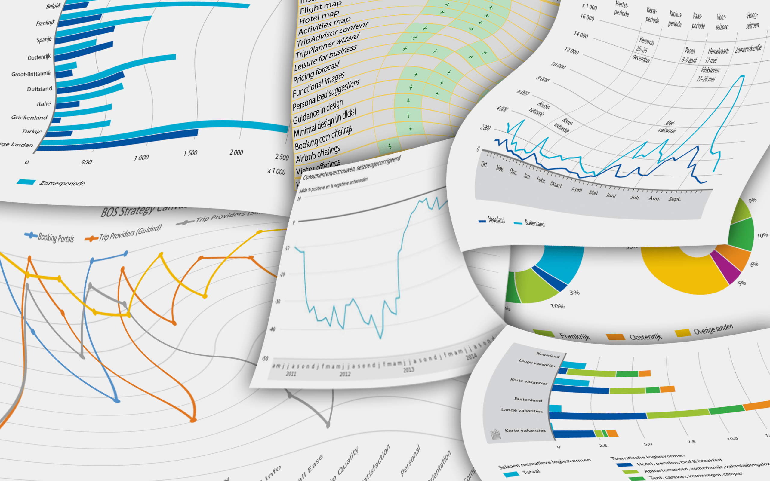
Some screenshots of independent research conducted on the travel industry on behalf of Pickuptrip
My Role
My Role
My Role
I was hired by Hitesh to envision the Pickuptrip ideology of travel. The nature of my work involved an output of concepts that were synthesised to creating the product flow wireframes. I also created the visual language and the logo that rendered the final UI elements of the design.
I was hired by Hitesh to envision the Pickuptrip ideology of travel. The nature of my work involved an output of concepts that were synthesised to creating the product flow wireframes. I also created the visual language and the logo that rendered the final UI elements of the design.
I was hired by Hitesh to envision the Pickuptrip ideology of travel. The nature of my work involved an output of concepts that were synthesised to creating the product flow wireframes. I also created the visual language and the logo that rendered the final UI elements of the design.
The Story of the Gaps
The Story of the Gaps
The Story of the Gaps
The travel technology companies, despite operating under severe regulations, have massive isolated gaps and identifying those and in trying to bridge them is where the need for Pickuptrip's existence came about. The gaps can be broadly classified in the following 3 areas:
The Industry Gap
The Bookings Domain Gap
The Technology Gap
The travel technology companies, despite operating under severe regulations, have massive isolated gaps and identifying those and in trying to bridge them is where the need for Pickuptrip's existence came about. The gaps can be broadly classified in the following 3 areas:
- The Industry Gap
- The Bookings Domain Gap
- The Technology Gap
The Industry Gap
The Industry Gap
The Industry Gap
Most travel-related digital offering focus on its own specialized subdomain, for e.g. 'bookings' being the biggest subdomain in the industry. But there is more to the industry than just that. Those segment of customer experience can be broken down into the following:
Dreaming
Booking
Discovering
Experiencing
Reflecting
Most travel-related digital offering focus on its own specialized subdomain, for e.g. 'bookings' being the biggest subdomain in the industry. But there is more to the industry than just that. Those segment of customer experience can be broken down into the following:
- Dreaming
- Booking
- Discovering
- Experiencing
- Reflecting
There are tons of websites, blogs and jealousy on social media that all propagate the 'dream' of wanting to travel. Then there are those who let you make the bookings. There are others that inform you on things happening in a new city and how to go about it and yet another few that nudge you to try a local delicacy or a new brag-worthy culture shocking moment you are going to be proud about for the rest of your life. And rounding that back to personal blogs, tons of recklessly used free Google photos backup and the other ones trying to get ahead in the race, all trying to offer you a place to reflect on your travel experiences and share it with the world and give back to the society of jealousy on social media and complete the loop.
But these experience live in silos. They are fragmented. But what if you could implicitly do all of those things in one place? What if by the medium of your choosing, you get to contextually experience one of the above-mentioned phases of travel. What if they were so smooth and seamless, that you don't even notice it. Bringing all of them together is the other gap we identified in the industry as a whole that also Pickuptrip aims to be solving.
The Booking Industry Gap
The Booking Industry Gap
The Booking Industry Gap
Obviously, a big chunk of what is made up of the entire scape of the online travel industry is not very surprisingly the 'booking' industry. Their aim is simple: be the nicest player in the market, offering the lowest prices, and profits will come. Come they do but they are very transactional. They aim to do one thing and one thing only; compete on prices. Some, based on the market segment they are targeting, might be a slightly more premium and offer better service for the whole booking experience. But the whole industry operates in the fundamental idea of servicing the needs of people who are purely looking for an avenue to complete a transaction based on having knowledge of one's travel plans.
Obviously, a big chunk of what is made up of the entire scape of the online travel industry is not very surprisingly the 'booking' industry. Their aim is simple: be the nicest player in the market, offering the lowest prices, and profits will come. Come they do but they are very transactional. They aim to do one thing and one thing only; compete on prices. Some, based on the market segment they are targeting, might be a slightly more premium and offer better service for the whole booking experience. But the whole industry operates in the fundamental idea of servicing the needs of people who are purely looking for an avenue to complete a transaction based on having knowledge of one's travel plans.
Obviously, a big chunk of what is made up of the entire scape of the online travel industry is not very surprisingly the 'booking' industry. Their aim is simple: be the nicest player in the market, offering the lowest prices, and profits will come. Come they do but they are very transactional. They aim to do one thing and one thing only; compete on prices. Some, based on the market segment they are targeting, might be a slightly more premium and offer better service for the whole booking experience. But the whole industry operates in the fundamental idea of servicing the needs of people who are purely looking for an avenue to complete a transaction based on having knowledge of one's travel plans.
But the whole industry operates in the fundamental idea of servicing the needs of people who are purely looking for an avenue to complete a transaction based on having knowledge of one's travel plans. But what if a person has the intention to travel, but is struck by one or all of the following parameters:
Travel dates
Travel destination
Budget for travel
But the whole industry operates in the fundamental idea of servicing the needs of people who are purely looking for an avenue to complete a transaction based on having knowledge of one's travel plans. But what if a person has the intention to travel, but is struck by one or all of the following parameters:
- Travel dates
- Travel destination
- Budget for travel
Being able to discover destinations to travel to, with or without having dates or budget for the same is another gap that hasn't been identified yet and there are countless ways to solve them. That gap is another opportunity we are having a go at Pickuptrip. Combine that with the analytics engine that discovers price forecasting, traveller insights, user behaviour and more, it brings a new dimension to the industry of online travel.
Being able to discover destinations to travel to, with or without having dates or budget for the same is another gap that hasn't been identified yet and there are countless ways to solve them. That gap is another opportunity we are having a go at Pickuptrip. Combine that with the analytics engine that discovers price forecasting, traveller insights, user behaviour and more, it brings a new dimension to the industry of online travel.
Being able to discover destinations to travel to, with or without having dates or budget for the same is another gap that hasn't been identified yet and there are countless ways to solve them. That gap is another opportunity we are having a go at Pickuptrip. Combine that with the analytics engine that discovers price forecasting, traveller insights, user behaviour and more, it brings a new dimension to the industry of online travel.

The Technology Gap
The Technology Gap
The Technology Gap
Apart from the booking segment and the travel industry itself, the other major gap that lies in travel technology is the technology itself. Most travel booking companies rely on patented technology that is being done the old way and there is little to no machine learning that goes along with modernising it. Being heavily regulated: and for good reason, allows only for competition playing by the rule book within the realm of instructions.
Apart from the booking segment and the travel industry itself, the other major gap that lies in travel technology is the technology itself. Most travel booking companies rely on patented technology that is being done the old way and there is little to no machine learning that goes along with modernising it. Being heavily regulated: and for good reason, allows only for competition playing by the rule book within the realm of instructions.
Apart from the booking segment and the travel industry itself, the other major gap that lies in travel technology is the technology itself. Most travel booking companies rely on patented technology that is being done the old way and there is little to no machine learning that goes along with modernising it. Being heavily regulated: and for good reason, allows only for competition playing by the rule book within the realm of instructions.
Plugging it into Pickuptrip
Plugging it into Pickuptrip
Plugging it into Pickuptrip
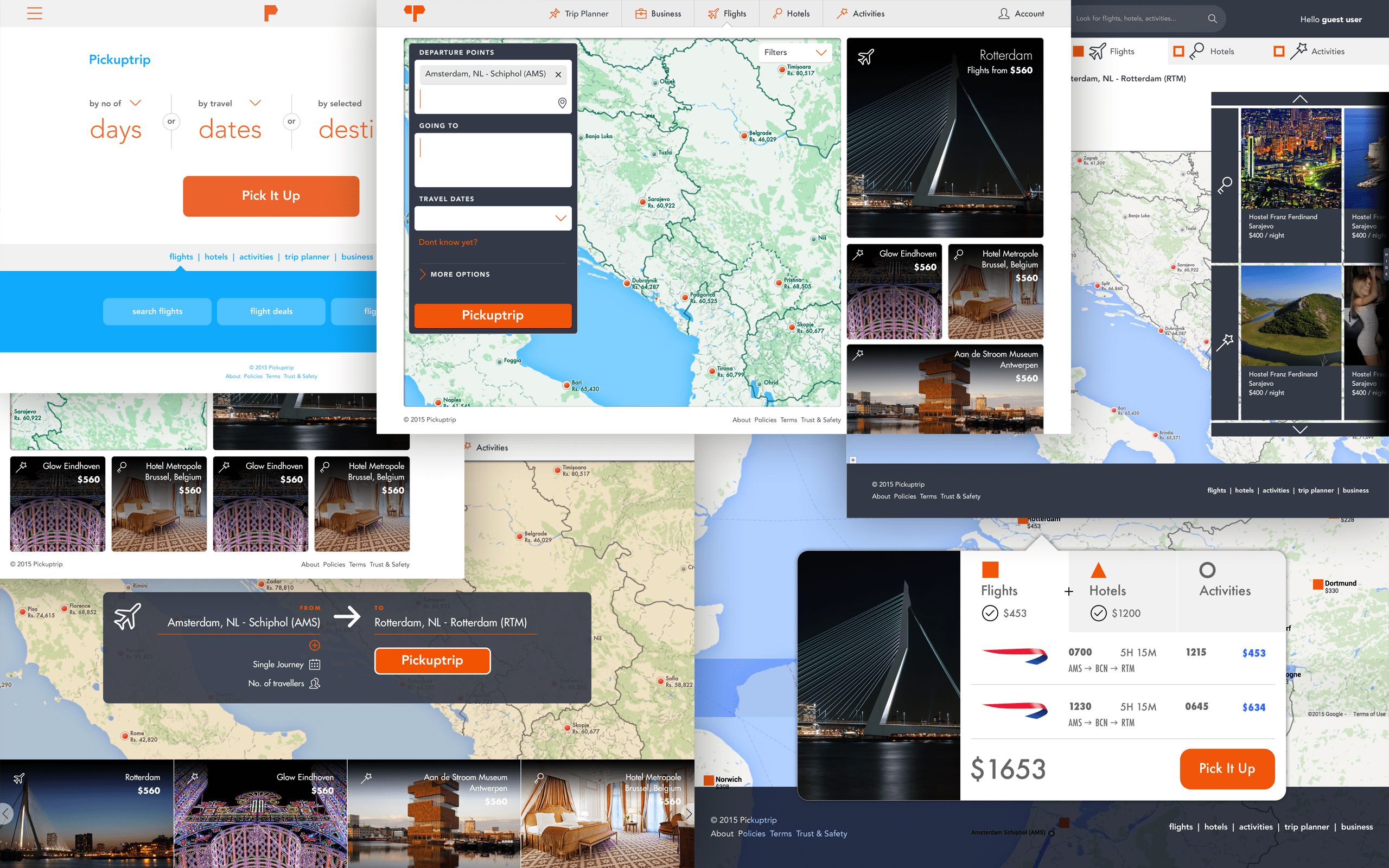
Some design iterations at an earlier stage
Some design iterations at an earlier stage
Above are some explorations and some radical ideas that we chucked out in favour of building something that was more based on research and targeting specific audiences for the launch phase of the product. In wanting to bridge the industry gap of having the above mentioned 5 customer experience cycles, we identified the best way to approach it by the context of the devices a traveller might have at different points in the cycle.
Above are some explorations and some radical ideas that we chucked out in favour of building something that was more based on research and targeting specific audiences for the launch phase of the product. In wanting to bridge the industry gap of having the above mentioned 5 customer experience cycles, we identified the best way to approach it by the context of the devices a traveller might have at different points in the cycle.
Above are some explorations and some radical ideas that we chucked out in favour of building something that was more based on research and targeting specific audiences for the launch phase of the product. In wanting to bridge the industry gap of having the above mentioned 5 customer experience cycles, we identified the best way to approach it by the context of the devices a traveller might have at different points in the cycle.
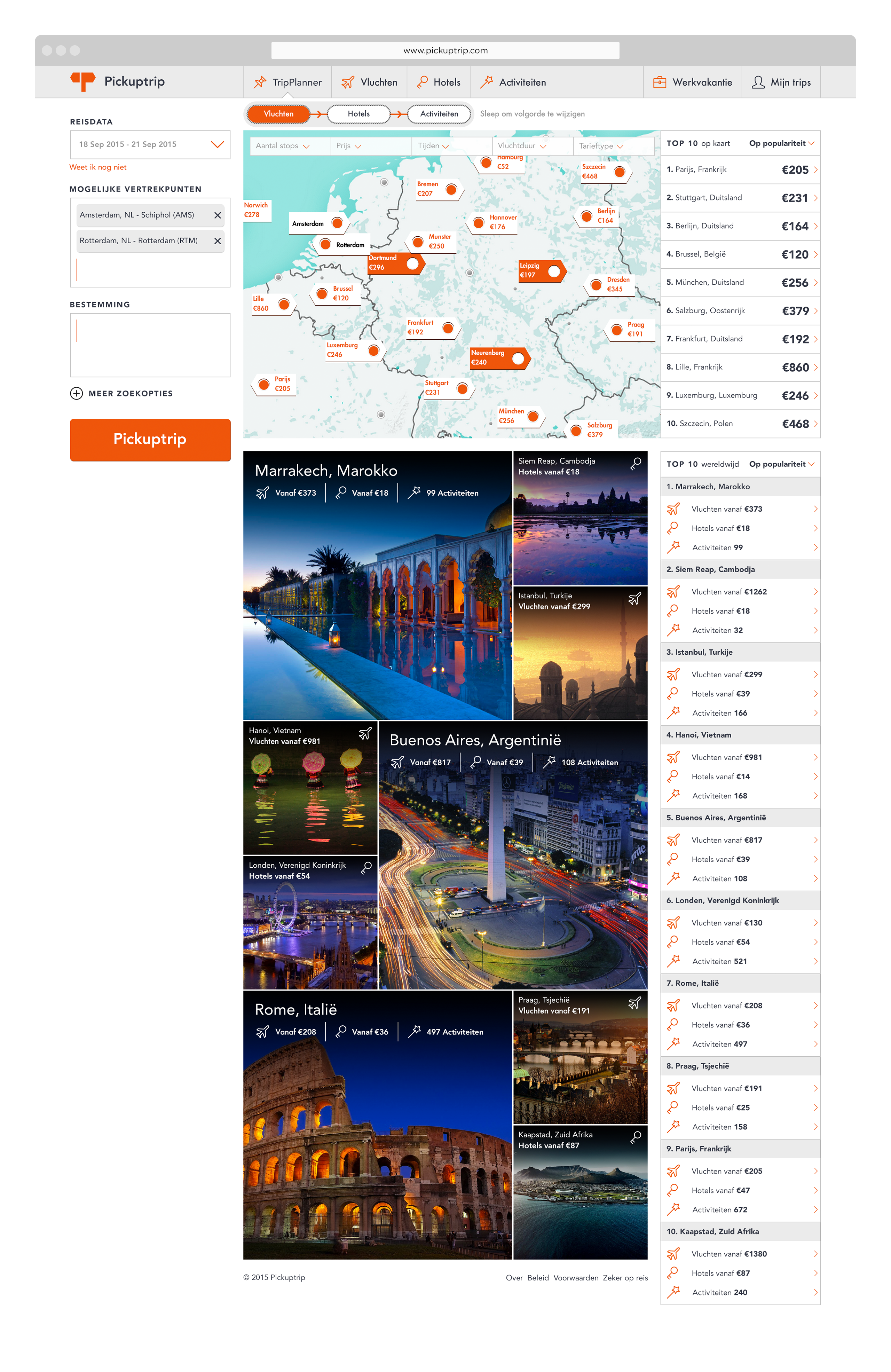
Pickuptrip.com becomes the homepage to dream. Logging in, let's you make bookings along with pushing more things at you to continue the dreaming. For this the website needed to be rich with imagery, different sizes, with deals and offers at different points all driving you towards better prices and happier travelling. The pickup trip travel companion app aims to have the discovering and experiencing part of the journey. And finally, the meeting point again of both the web and phone interface is where lies the last leg of the journey: reflecting, conveniently available on both platforms.
The journey of what we are building at Pickuptrip is merely a tip of the iceberg. There is a lot under the hood that the overview of our plans mentioned above. Our journey of making wonderful journeys is just about the beginning.
Other Projects

SurePeople Proper HamburgerUI + UX

2018 CalendarGraphic Design
Rejected Web DesignsWeb Design
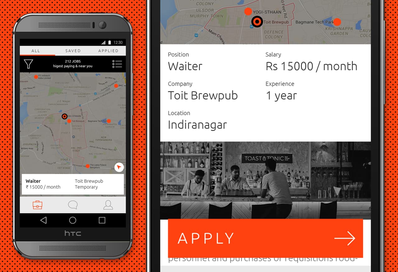
Designing an app for the grey collared job marketProduct Design

Repositioning by rebranding: the Moonraft brand storyProduct Design
LogofolioGraphic Design

Pankaj & Priya wedding collateral designsGraphic Design

The MYLK propaganda designsGraphic Design
